Part 4. 시각화 도구
- Matplotlib
- 그래프 그리기 기초
- titanic 데이터 불러오기
1234567import pandas as pdimport matplotlib.pyplot as pltimport seaborn as snsdf = sns.load_dataset('titanic')df10 = df.iloc[:10] - 그래프 1
123plt.figure(figsize=(4,3))plt.plot(df10['fare'])plt.show()
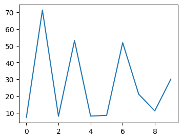
- 그래프 2
1234plt.figure(figsize=(4,3))plt.plot(df10['fare'])plt.plot(df10['age'])plt.show()

-
그래프 3
123456plt.figure(figsize=(8,3))plt.subplot(1,2,1)plt.plot(df10['fare'])plt.subplot(1,2,2)plt.plot(df10['age'])plt.show()
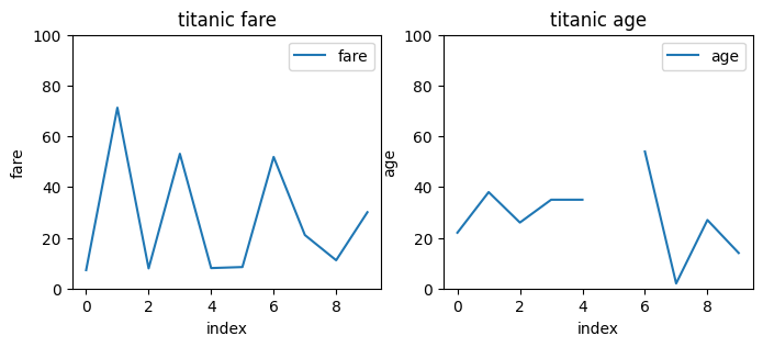
- 그래프 4
12345678910111213141516171819plt.figure(figsize=(8,3))plt.subplot(1,2,1)plt.plot(df10['fare'])plt.title('titanic fare')plt.xlabel('index')plt.ylabel('fare')plt.ylim(0, 100)plt.legend(labels=['fare'], loc='best')plt.subplot(1,2,2)plt.plot(df10['age'])plt.title('titanic age')plt.xlabel('index')plt.ylabel('age')plt.ylim(0, 100)plt.legend(labels=['age'], loc='best')plt.show()
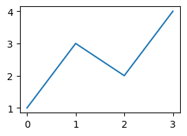
- 그래프 5
123plt.figure(figsize=(3,2))plt.plot([1,3,2,4])plt.show()
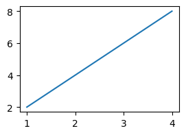
- 그래프 6
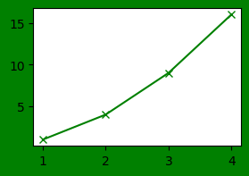
1234567import matplotlib.pyplot as pltx = [1,2,3,4]y = [2,4,6,8]plt.figure(figsize=(3,2))plt.plot(x, y)plt.show()
- 그래프 7
12345678910111213import matplotlib.pyplot as pltimport numpy as npx = np.linspace(-10,10,100)y = x * 2y2 = 2 * x * xy3 = np.sin(x) * 100plt.figure(figsize=(3,2))plt.plot(x, y)plt.plot(x, y2)plt.plot(x, y3)plt.show()

- 그래프 8
12345import matplotlib.pyplot as pltplt.figure(figsize=(3,2), facecolor='g', edgecolor='r')plt.plot([1,2,3,4], [1,4,9,16], 'gx-')plt.show()
- 그래프 9
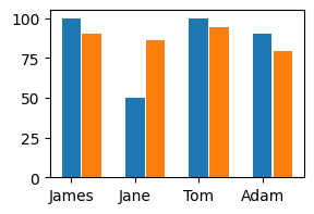
123456789101112import matplotlib.pyplot as pltname = ['James', 'Jane', 'Tom', 'Adam']kor = [100, 50, 100, 90]eng = [90, 86, 94, 79]xpos = np.arange(len(kor))plt.figure(figsize=(3,2))plt.bar(xpos, kor, width=0.3)plt.bar(xpos+0.32, eng, width=0.3)plt.xticks(xpos, name)plt.show()
- 그래프 10
12345678910111213import matplotlib.pyplot as pltname = ['James', 'Jane', 'Tom', 'Adam']kor = [100, 50, 100, 90]eng = [90, 86, 94, 79]ypos = np.arange(len(kor))plt.figure(figsize=(3,2))plt.barh(ypos, kor, height=0.3)plt.barh(ypos+0.32, eng, height=0.3)plt.yticks(xpos, name)plt.title('Sungjuk')plt.show()

- 그래프 11
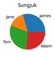
12345678910import matplotlib.pyplot as pltname = ['James', 'Jane', 'Tom', 'Adam']kor = [100, 50, 100, 90]eng = [90, 86, 94, 79]plt.figure(figsize=(3,2))plt.pie(kor, labels=name)plt.title('Sungjuk')plt.show()
- 그래프 12
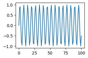
1234567891011121314import matplotlib.pyplot as pltimport numpy as npimport math#X = range(100)#Y = [math.sin(v) for v in X]#X = np.arange(100)#Y = np.sin(X)X = np.linspace(0,100,101)Y = np.sin(X)plt.figure(figsize=(3,2))plt.plot(X, Y)plt.show()
- 그래프 13
12345678910import matplotlib.pyplot as pltname = ['James', 'Jane', 'Tom', 'Adam']kor = [100, 50, 100, 90]eng = [90, 86, 94, 79]plt.figure(figsize=(2,2))plt.scatter(kor, eng)plt.title('Sungjuk')plt.show()

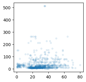
- 그래프 14
12345678import seaborn as snsimport matplotlib.pyplot as pltdf = sns.load_dataset('titanic')plt.figure(figsize=(3,3))plt.scatter(df['age'], df['fare'], marker='o', s=15, alpha=0.1)plt.show()
- 그래프 15
12345678import numpy as npimport matplotlib.pyplot as pltX = np.random.randn(100)plt.figure(figsize=(3,3))plt.boxplot(X)plt.show()

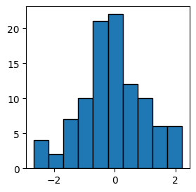
- 그래프 16
12345678import numpy as npimport matplotlib.pyplot as pltX = np.random.randn(100)plt.figure(figsize=(3,3))plt.hist(X, bins=10, edgecolor='k' )plt.show()
- titanic 데이터 불러오기
- 그래프에 주석 표시
- 주석 표시1 plt.annotate(”, xy=(20, 620000), #화살표의 머리 부분(끝점) xytext=(2, 290000), #화살표의 꼬리 부분(시작점) xycoords=’data’, #좌표체계 arrowprops=dict(arrowstyle=’->’, color=’skyblue’, lw=5), #화살표 서식 )
- 주석 표시2 plt.annotate(‘인구이동 증가(1970-1995)’, #텍스트 입력 xy=(10, 550000), #텍스트 위치 기준점 rotation=25, #텍스트 회전각도 va=’baseline’, #텍스트 상하 정렬 ha=’center’, #텍스트 좌우 정렬 fontsize=15, #텍스트 크기 )
-
plt.annotate(”,xy=(20, 620000), #화살표의 머리 부분(끝점)xytext=(2, 290000), #화살표의 꼬리 부분(시작점)xycoords=’data’, #좌표체계arrowprops=dict(arrowstyle=’->’, color=’skyblue’, lw=5), #화살표 서식)
- 선 그래프 꾸미기 옵션
- ‘o’ : 선 그래프가 아니라 점 그래프로 표현
- marker = ‘o’ : 마커모양 (‘*’, ‘+’, ‘.’, 등)
- markerfacecolor = ‘green’ : 마커 색상
- markersize = 10 : 마커 크기
- color = ‘olive’ : 선 색상
- linewidth = 2 : 선 두께
- label = ‘서울 -> 경기’ : 라벨 지정
- 그래프 그리기 기초
- Seaborn 그래프 그리기
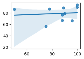
- 그래프 1
123456789import matplotlib.pyplot as pltimport seaborn as snsdf = sns.load_dataset('titanic')plt.figure(figsize=(3,2))#sns.regplot(x='age', y='fare', data=df)sns.regplot(x=df['age'], y=df['fare'])plt.show()

- 그래프 2
123456789import matplotlib.pyplot as pltimport seaborn as snskor = [100, 50, 100, 90, 75, 88, 78, 89, 96, 88]eng = [90, 86, 94, 79, 56, 76, 87, 89, 66, 67]plt.figure(figsize=(3,2))sns.regplot(x=kor, y=eng)plt.show()
- 그래프 3
1234567891011import matplotlib.pyplot as pltimport seaborn as snsdf = sns.load_dataset('titanic')plt.figure(figsize=(3,2))#sns.histplot(x='fare', bins=100, data=df)#sns.histplot(x=df['fare'], bins=100)#sns.distplot(x=df['fare'], bins=100)sns.kdeplot(x=df['fare'])plt.show()

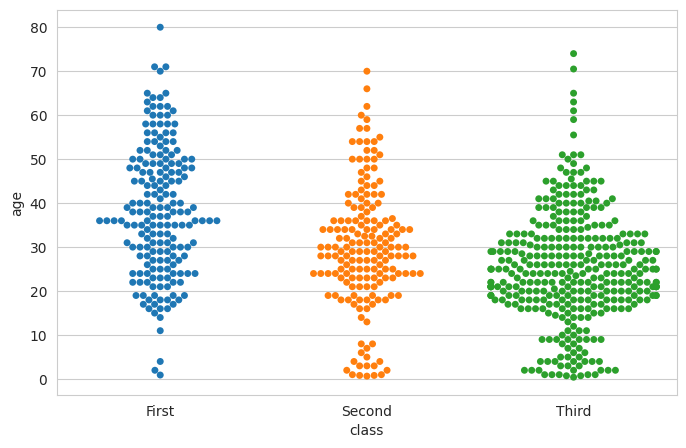
- 그래프 4
12345678910import matplotlib.pyplot as pltimport seaborn as snssns.set_style('whitegrid')df = sns.load_dataset('titanic')plt.figure(figsize=(8,5))#sns.stripplot(x=df['class'], y=df['age'], hue=df['class'])sns.swarmplot(x=df['class'], y=df['age'], hue=df['class'])plt.show()
- 그래프 1